
22 Best Food Fonts for Restaurant Logos, Menus & Packaging
Explore 22 food fonts for restaurant logos, menu headings, and packaging. Compare vintage, rounded, script, and modern styles from Sensatype.
A food logo, a menu heading, and a small packaging label ask different things of a typeface. A rounded font can suit a playful snack brand, while vintage lettering may fit a bakery or diner. A condensed design can help when a longer name has to fit a narrow label.
This selection brings together 22 food fonts and display typefaces from Sensatype's own catalog, including vintage, rounded, script, and modern options. The recommendations below suggest where to start; use each product specimen and type tester to compare your actual brand name before choosing a font.
Most of these options are intended for prominent names and short headings. Build the rest of your layout around a readable companion font for dish descriptions, prices, ingredients, and other practical details.
Vintage and Retro Food Fonts
1. Cingle - Vintage Food Font

*Cingle font specimen. Suggested use: bakery branding and traditional food labels.*
Cingle brings the rounded, nostalgic lettering seen in its specimen to a bakery name or a traditional food label. Consider it when a brand should feel familiar and rooted in older shop signage. Use it for the brand name or a short product title, with simpler text underneath for ingredients and descriptions.
2. Brack - Bold Food Vintage Font

*Brack font specimen. Suggested use: retro diner logos and burger packaging.*
Brack gives a retro identity a heavier voice. Its product page lists black and black italic styles, which offer two directions for a short wordmark or promotional heading. Try the upright version for a main restaurant name and compare the italic version for an occasional special or campaign title.
3. Himiko - Bold Food Vintage Font
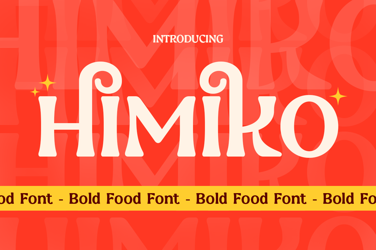
*Himiko font specimen. Suggested use: cafe wordmarks and short packaging titles.*
Himiko is worth considering when the name itself should carry decorative detail. The curls visible in its specimen give it a different character from the simpler block lettering elsewhere in this list. Try it on a cafe name or a short packaging title, then inspect the exact letters in your own brand name.
4. Delicy - Vintage Food Font

*Delicy font specimen. Suggested use: retro food labels and cafe promotions.*
Delicy offers Regular, Outline, and Extrude styles, making it useful for exploring a dimensional retro treatment. Start with the regular style for a cafe name, then compare the other styles on a short label or promotion. The extra treatments give you options without requiring a different typeface for each campaign.
5. Wisely - Retro Food Bold Font
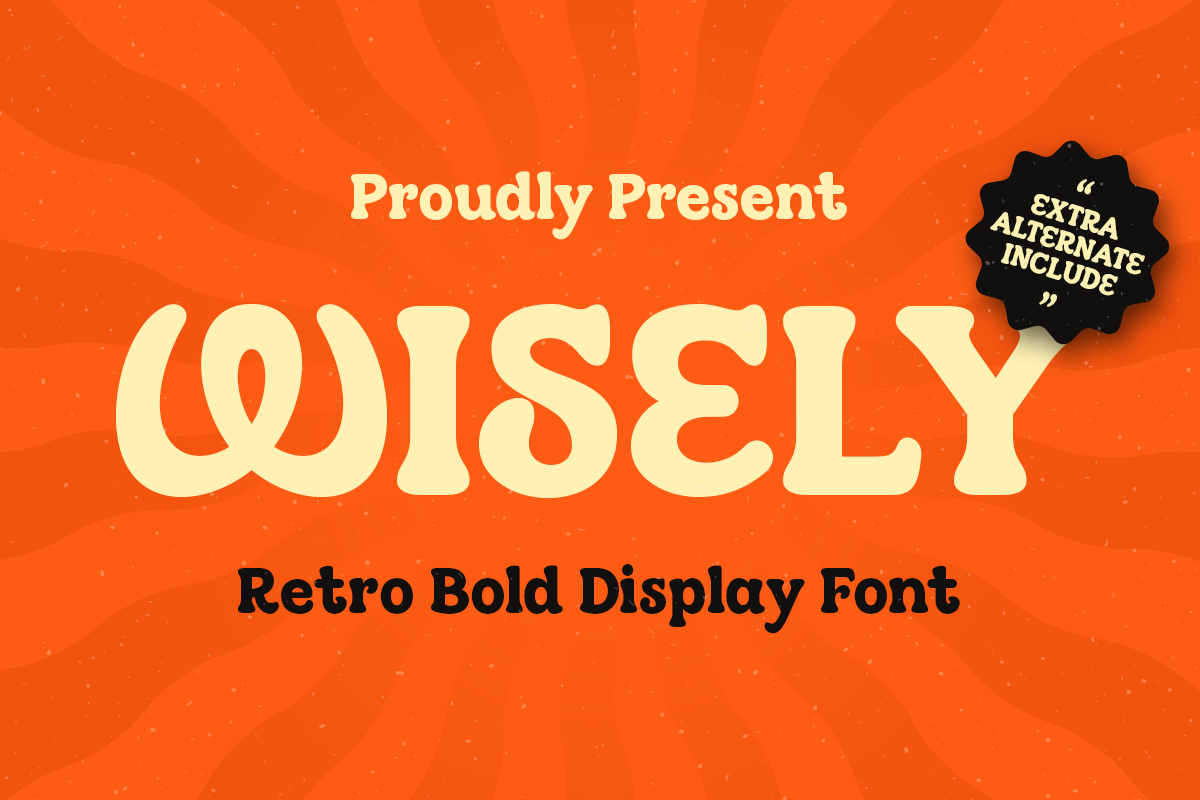
*Wisely font specimen. Suggested use: burger identities and nostalgic promotions.*
Wisely uses a more playful retro direction than a conventional block headline. Its specimen shows curved, expressive lettering that can become a focal point on a burger identity or a nostalgic food poster. Keep the main phrase short so the shapes have space to do their work.
6. Madge - Bold Vintage Font

*Madge font specimen. Suggested use: food brand names and promotional headlines.*
Madge is another route into vintage styling, with a bold word shape that can anchor a food brand name or a promotional headline. Compare it with Cingle using the same name and layout: the choice should follow the personality you want, rather than the vintage label alone.
Rounded and Playful Food Fonts
7. Bear Rounded - Rounded Bold Food Font
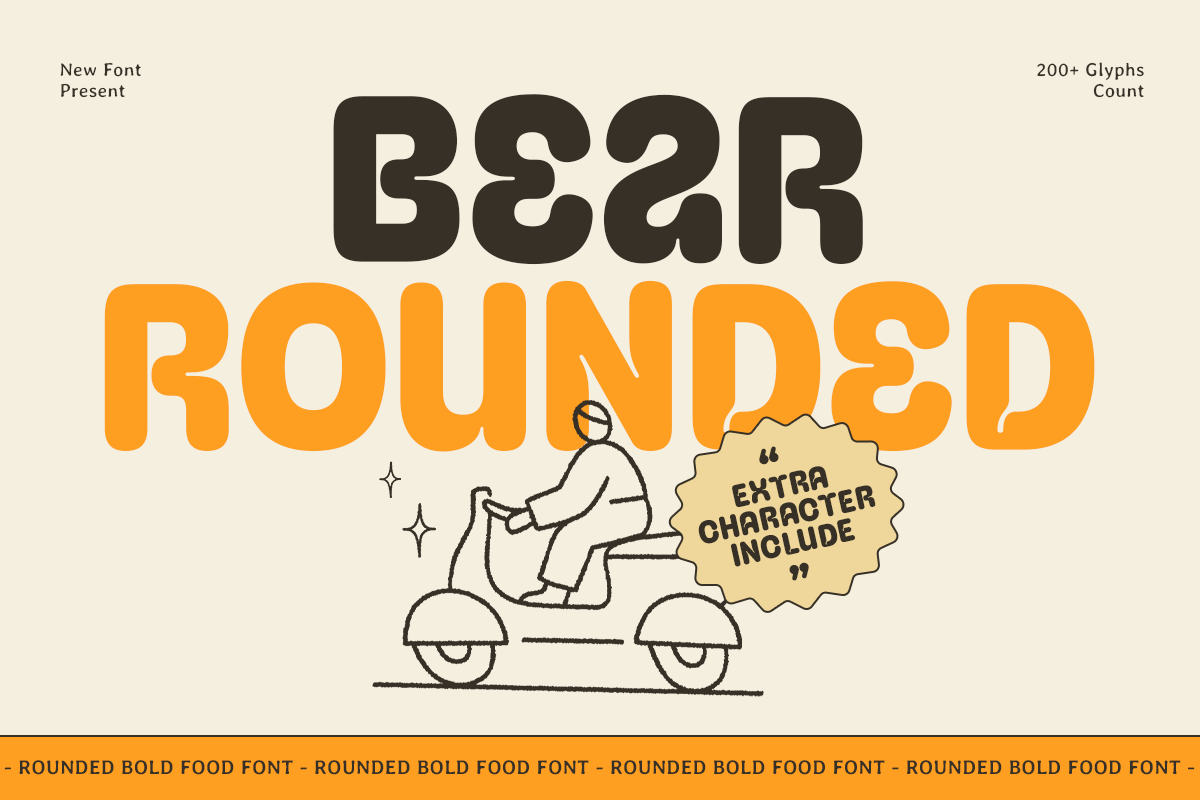
*Bear Rounded font specimen. Suggested use: snack labels and approachable cafe branding.*
Bear Rounded combines thick curves with a soft visual character. It is a starting point for a snack label, a cafe identity, or a food truck name that should feel informal. The rounded shapes are the main attraction, so compare them against your packaging silhouette and illustration style.
8. Renbo - Bold Food Branding Font
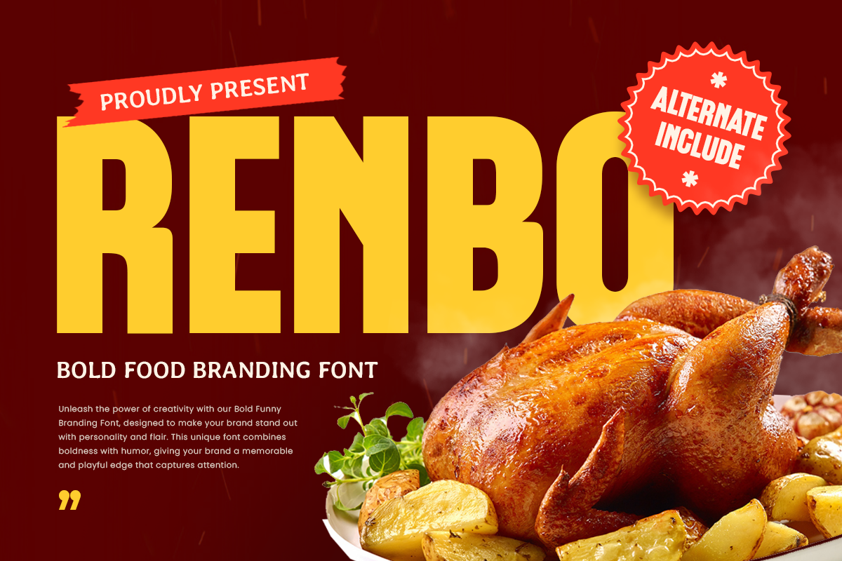
*Renbo font specimen. Suggested use: fast-food identities and prominent product names.*
Renbo pairs chunky forms with rounded corners for a bold food-branding direction. Try it when a takeaway logo or a prominent product name needs a substantial shape. The product specimen shows the lettering alongside food photography, which is a useful starting reference for balancing type with an image.
9. Chubaq - Rounded Food Font
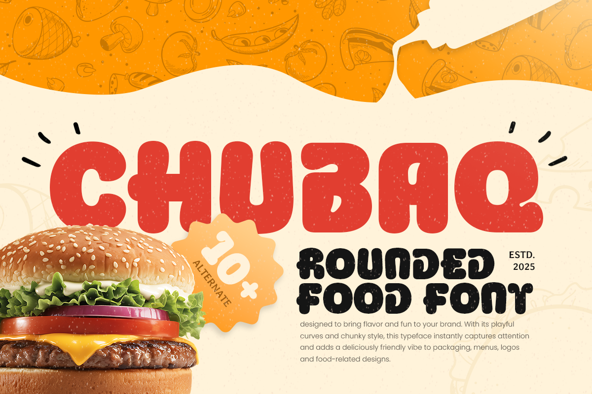
*Chubaq font specimen. Suggested use: burger packaging and playful product labels.*
Chubaq has plump, rounded forms suited to a playful food identity. Consider it for a burger box title, a snack label, or a short menu heading. Its specimen is especially useful for judging how a wide, rounded word can sit above a food photograph without needing a complex typographic treatment.
10. Golda - Funny Food Font
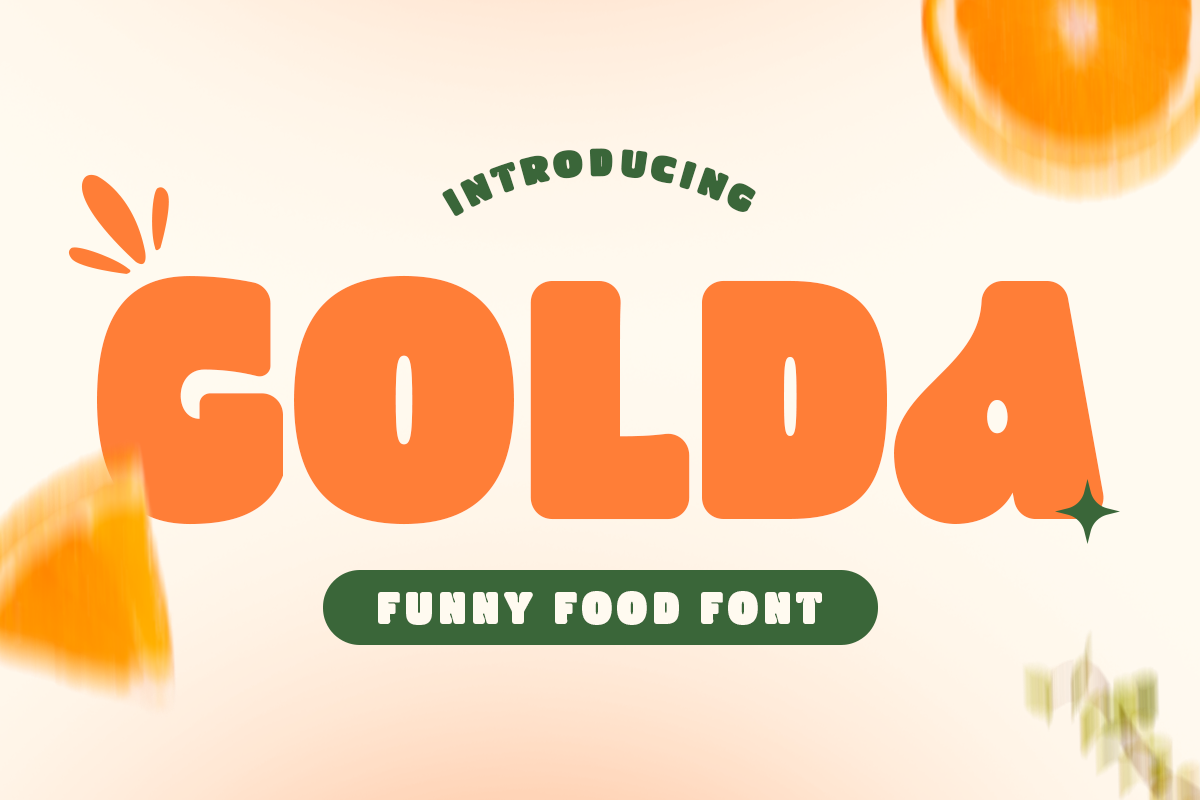
*Golda font specimen. Suggested use: family restaurant promotions and cheerful campaigns.*
Golda offers a heavy, playful alternative for a family restaurant promotion or a cheerful food campaign. Its specimen uses a short, prominent word with ample space around it. Apply that same restraint to your own layout: a strong heading can do more than several competing slogans.
11. Salgen - Kids Funny Food Font
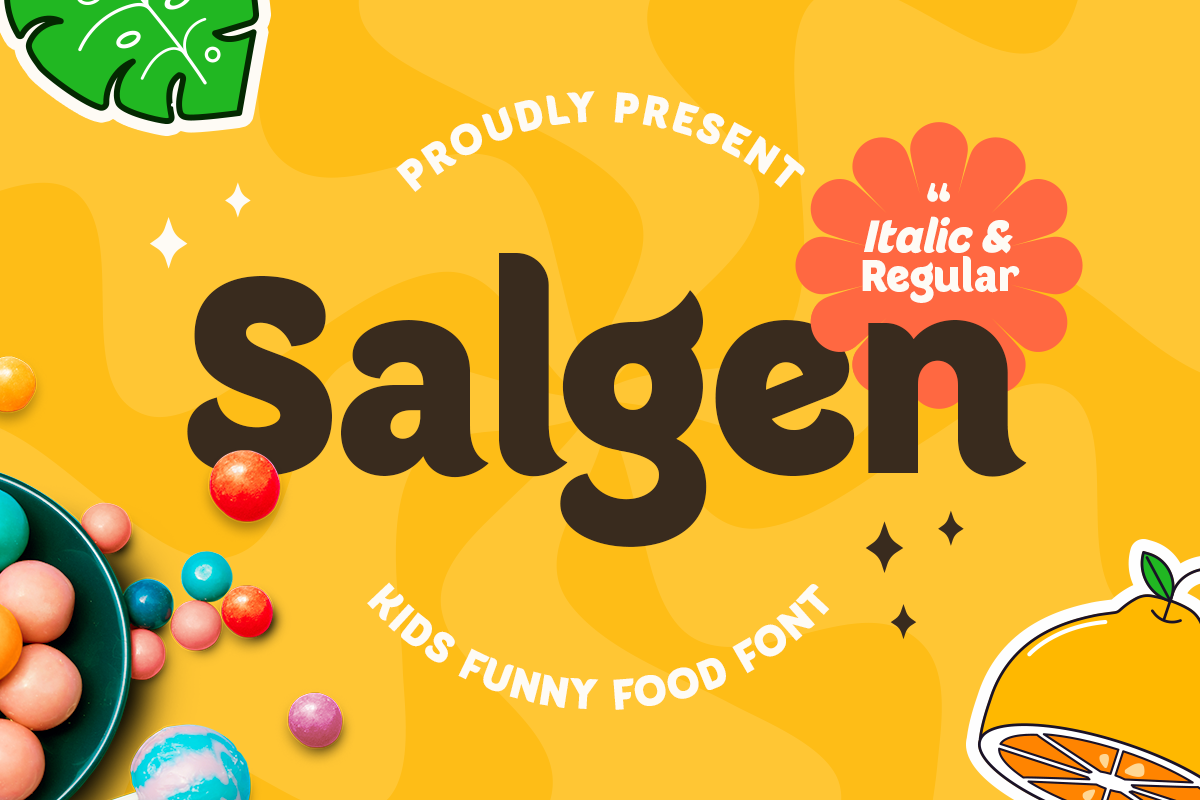
*Salgen font specimen. Suggested use: children's menu headings and family food brands.*
Salgen is aimed at playful projects, including children's products and family food branding. Its product page lists Regular and Italic styles, letting you explore a secondary emphasis within the same family. Try it for a children's menu title or a short name on colorful food packaging.
12. Rayon - Chunky Funny Food Branding Font
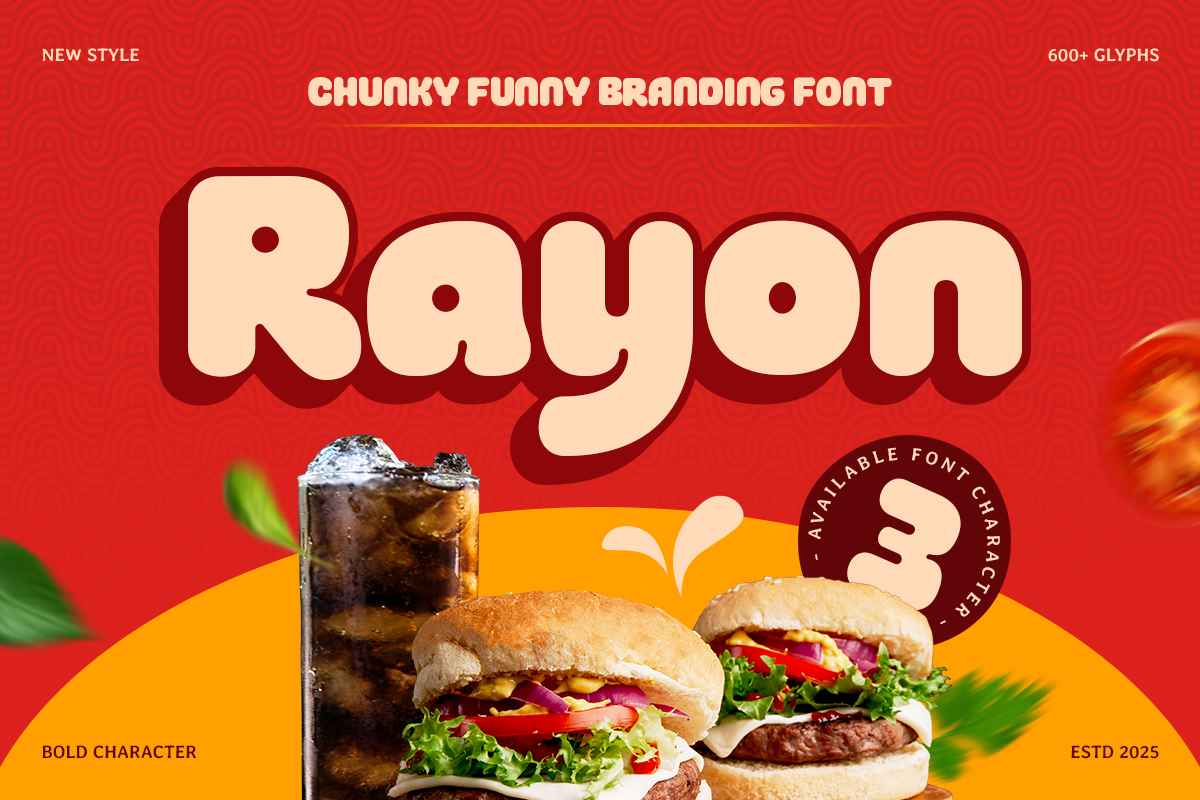
*Rayon font specimen. Suggested use: snack wrappers, candy brands, and food trucks.*
Rayon offers Regular, Outline, and Extrude styles in a chunky, rounded design. That makes it a useful candidate when a snack brand or food truck needs both a main wordmark and occasional display treatments. Compare the styles in the same layout before deciding which one belongs in the core identity.
13. Broda - Big Fat Rounded Food Font
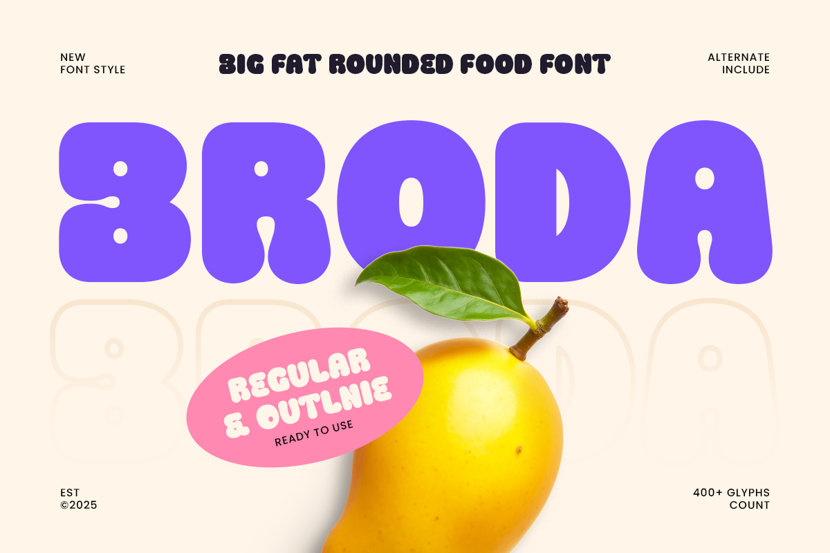
*Broda font specimen. Suggested use: beverage labels and bold snack packaging.*
Broda takes rounded lettering in a particularly heavy direction. The specimen pairs its broad purple forms with a lemon image, suggesting a starting point for a beverage label or a bold snack name. Test how the complete word balances with photography, especially when the package has limited front-facing space.
Bold Food Fonts for Menu Headings and Promotions
14. Meals - Bold Food Font
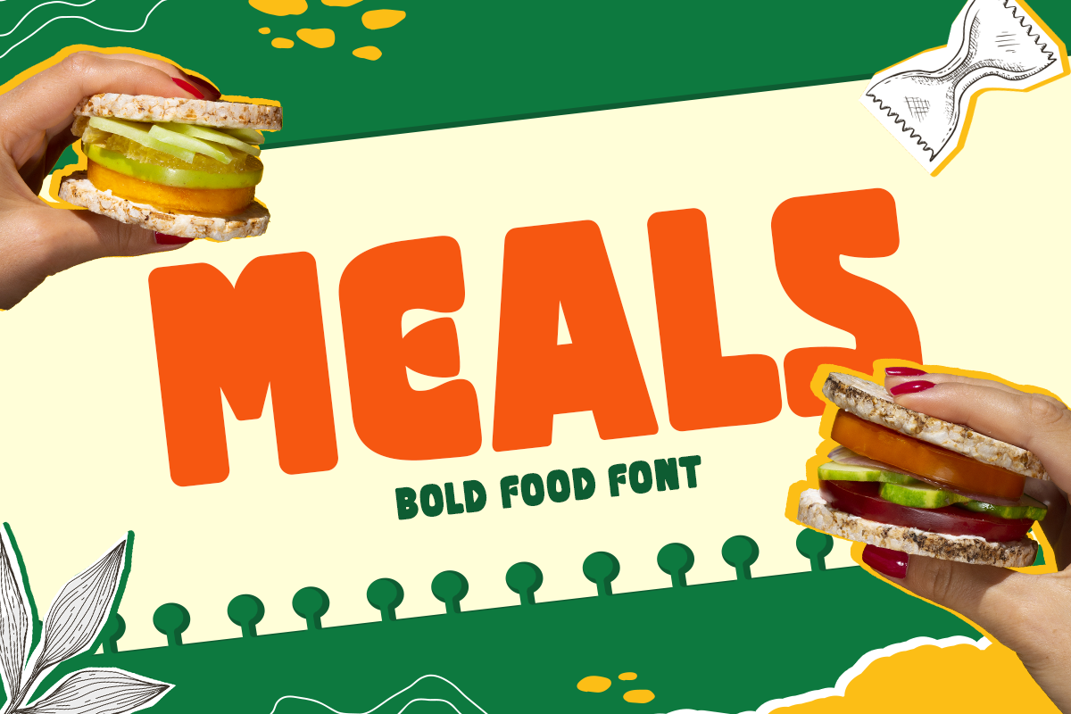
*Meals font specimen. Suggested use: burger branding and short menu category titles.*
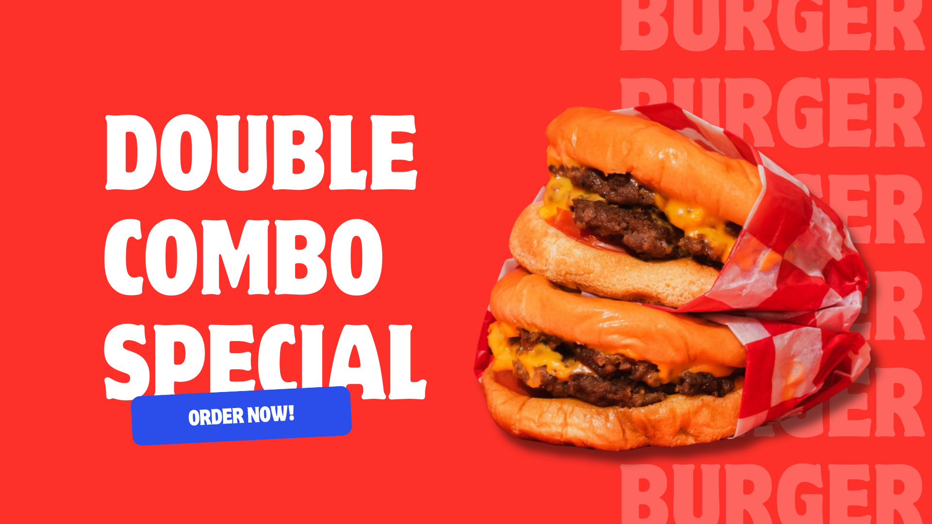
Meals offers bold, playful lettering for restaurant names and short menu headings. Its specimen places the name between burger photographs, showing a direct food-branding application. Try it on a burger concept, a takeaway bag, or a menu category title, then compare the lettering against the amount of photography in the layout.
15. Bravco - Unique Bold Logo Food Font
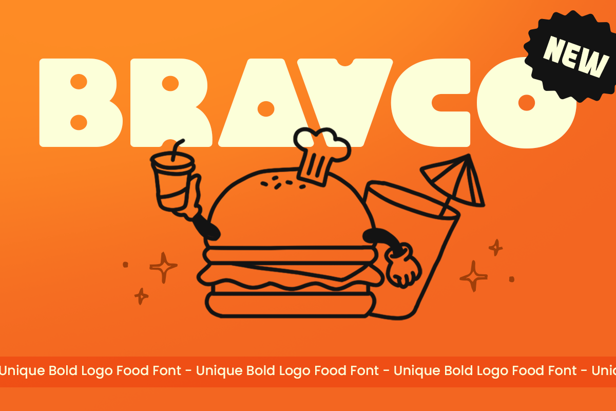
*Bravco font specimen. Suggested use: cafe signs and prominent takeaway branding.*
Bravco uses substantial letterforms for a confident logo or display heading. Its specimen combines an uppercase name with a simple burger illustration. That makes it a useful candidate for a cafe sign, a takeaway identity, or a food poster where the name and one image carry most of the composition.
16. Artyka - Heavy Bold Food Font
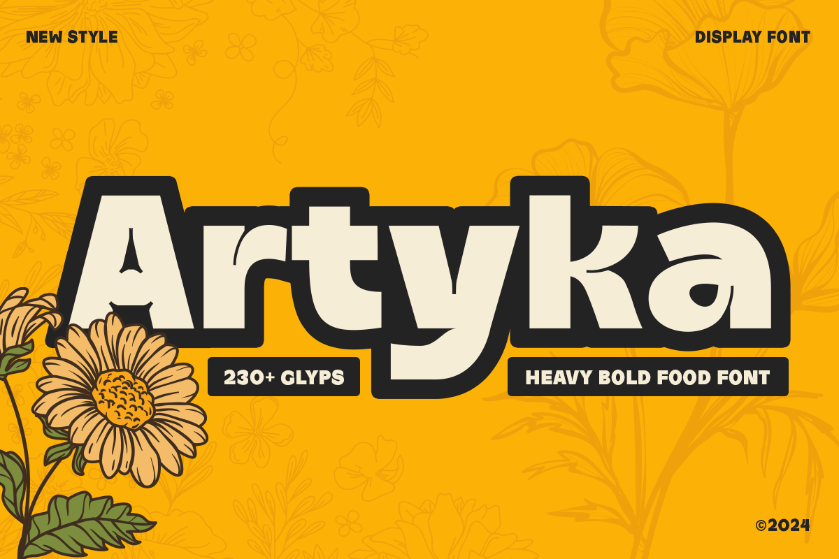
*Artyka font specimen. Suggested use: food festival posters and campaign titles.*
Artyka brings heavy display lettering to food and beverage projects. Consider it for a food festival title, a promotional poster, or a short restaurant campaign. The specimen presents it as a dominant name with a strong edge, so evaluate it at headline size before planning smaller supporting applications.
17. Baked - Heavy Food Font
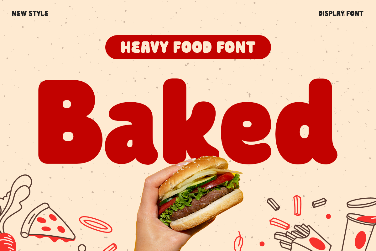
*Baked font specimen. Suggested use: bakery names and short offer headings.*
Baked is a candidate for a bakery name, a short offer heading, or a food promotion that needs heavy lettering. Its specimen sets a single large word among food images. Use that as a starting layout, then test whether the same weight suits the tone of your own bakery or restaurant.
18. Gestard - Headline Food Font
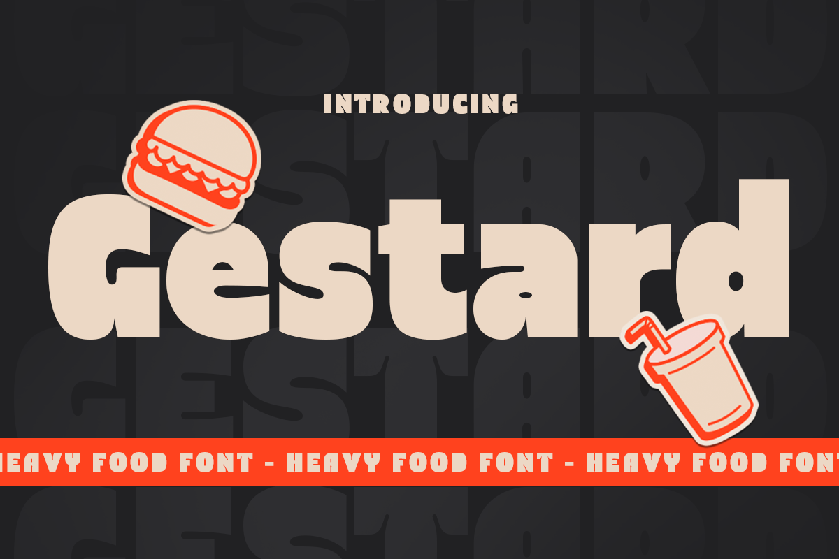
*Gestard font specimen. Suggested use: menu category headings and specials boards.*
Gestard is positioned as a headline food font, making it a candidate for category titles and short specials-board messages. Its specimen puts a broad word against a dark background with a small food illustration. Try a similarly simple composition when the message needs to be identified quickly.
Modern Logo Fonts and a Script Alternative
19. Hexon - Unique Modern Food Logo Font
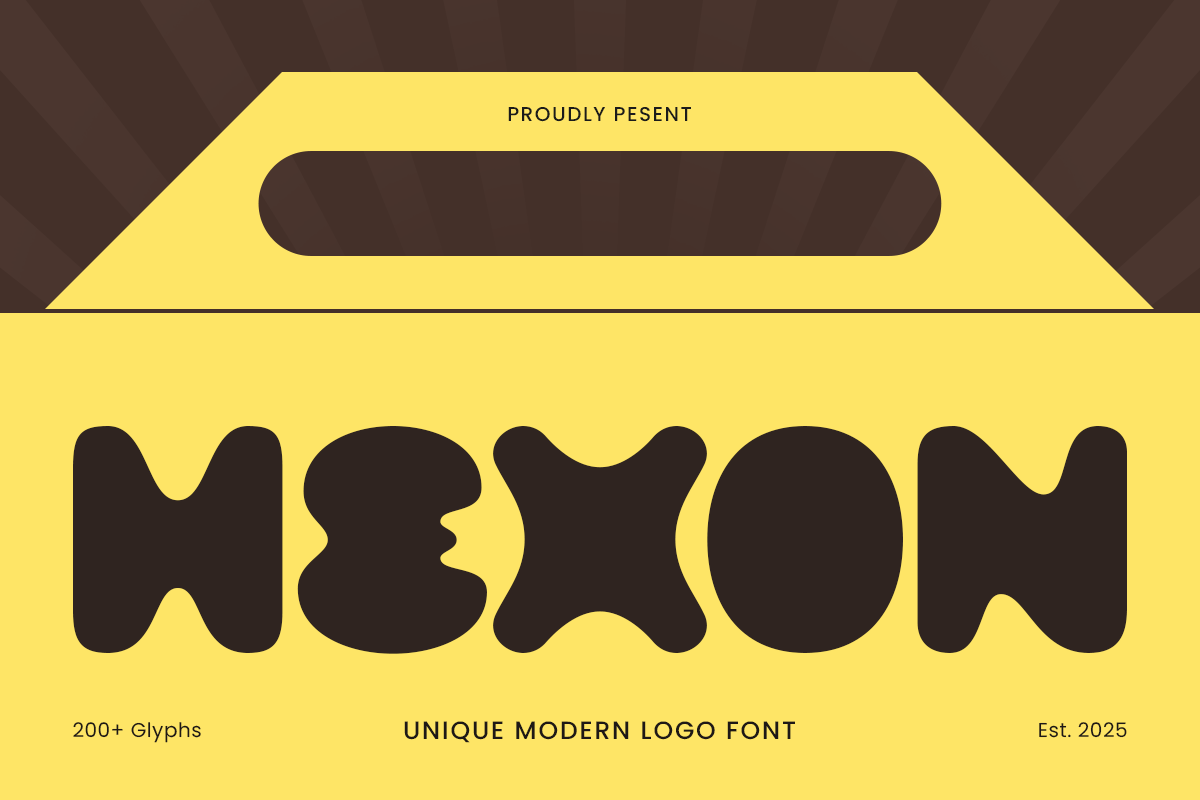
*Hexon font specimen. Suggested use: contemporary restaurant and beverage identities.*
Hexon is a modern option for a restaurant name, a beverage label, or a new food concept that does not need a vintage reference. Its specimen uses distinctive rounded lettering in a packaging-style composition. Compare the exact brand name with a simpler alternative to decide how much personality the logo should carry.
20. Barcola - Unique Display Logo Script Font
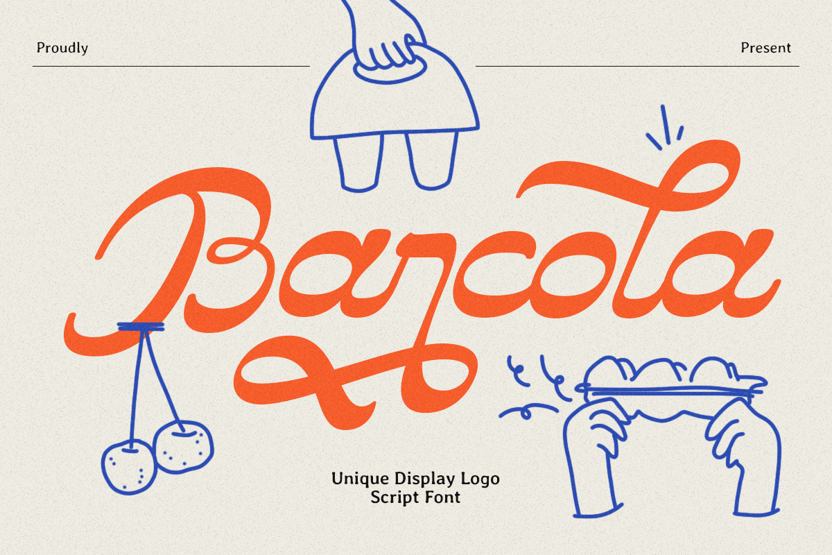
*Barcola font specimen. Suggested use: cafe wordmarks and a scripted brand accent.*
Barcola offers a script alternative to the block and rounded fonts in this collection. Its flowing lettering can be explored for a cafe wordmark or a short brand accent on packaging. Because a script changes character with the letters in a name, use your real wording in the product tester before choosing it.
21. Bolda - Bold Condensed Logo Font
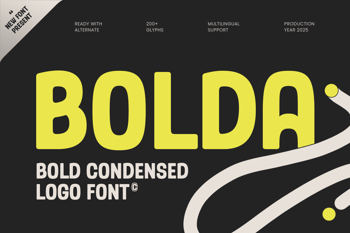
*Bolda font specimen. Suggested use: longer food brand names and narrow label areas.*
Bolda combines condensed proportions with rounded details. Consider it when a longer food brand name needs to fit a narrow label area or a compact wordmark. It offers a different layout starting point from the broader rounded choices, but the final decision still depends on your wording and available space.
22. Atlanta - Display Font Modern Bold
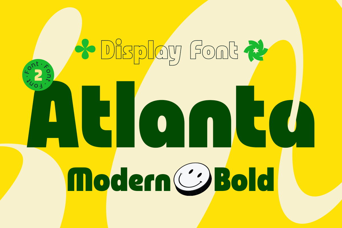
*Atlanta font specimen. Suggested use: modern campaign headings and packaging titles.*
Atlanta is a general modern display option that can be applied to food campaigns as well as other branding projects. Its product page lists Regular and Outline styles. Consider it for a short packaging title or a modern promotion when you want to move away from overtly vintage lettering.
How to choose a food font for your project
Separate the logo from the menu text
A distinctive wordmark does not need to become the font for every part of a menu. Keep the display face for the brand name and selected headings. Use a companion face with clear letters and numerals for dish descriptions and prices. Compare the hierarchy on a complete menu, not just a logo mockup.
Match the style to the food business
Start with the tone of the business. Explore Cingle, Brack, Delicy, or Wisely for a retro direction; Bear Rounded, Chubaq, or Rayon for a playful identity; and Hexon, Bolda, or Atlanta for a more modern approach. These are starting points, and the name, colors, photography, and layout will affect the result.
Test the real words at the real size
Try the restaurant name, a long dish name, prices, punctuation, and any accented characters your project requires. For packaging, print a sample at the intended size. For signage, check the design from the expected viewing distance. Inspect counters, letter spacing, and the outline or layered treatments you plan to use.
Use supporting type consistently
Keep a small, defined set of type roles across the identity: a brand or display face, a heading style, and readable supporting text. You can keep the system consistent across menus, packaging, and social graphics without forcing one decorative font into every role.
Check the license for the intended use
Before purchasing, review the Sensatype licensing guide for your project. Logo and trademark use, website embedding, merchandise, and advertising can involve different requirements. If a client project includes several uses, Contact Sensatype to confirm the appropriate coverage.
Questions about food fonts
Q: Which food fonts suit vintage restaurant branding?
A: Start by comparing Cingle, Brack, Delicy, and Wisely. Each offers a different retro direction. Set the same restaurant name in the candidates, then judge the result alongside your colors, food photography, and packaging layout.
Q: Can a bold display font be used throughout a restaurant menu?
A: Use it selectively for the restaurant name, category headings, or a short promotion. For descriptions, prices, and dietary information, choose supporting text that remains clear at the intended size. A menu needs several levels of information, and a single heavy style can make those levels harder to distinguish.
Q: How can I compare fonts before choosing one?
A: Open the linked product pages and try the same wording in their type testers. Compare similar text sizes and layouts so you are evaluating the lettering rather than the specimen colors. Check the product details for included styles and the characters your project needs.
Q: Try a shortlist with your own brand name
A: Choose two or three candidates that fit your brief and build a small comparison using the same restaurant name, menu title, and packaging label. Check the design at its intended size, then explore the product details and license before purchasing. You can also [browse the full Sensatype font collection](https://sensatype.com/fonts) for a different direction.