
Best 20 Futuristic Fonts for Sports Branding
There's a moment in every sports campaign where the font either carries the energy or kills it. The right typeface doesn't just spell out a team name. It communicates speed, power, tension, and identity before anyone reads a single word.
Futuristic fonts have become the go-to direction for sports branding, and for good reason. They sit right at the intersection of athletic energy and modern aesthetics. Whether you're designing a soccer tournament poster, an e-sport team identity, or a social media campaign for a gym, the font you choose sets the entire visual tone.
This article walks through some of the best futuristic fonts for sports branding right now, with real ideas on how to use each one.
Why Font Choice Matters More Than You Think
Before jumping into the list, here's something worth sitting with: every sports event, every team, every campaign has a different visual direction. A marathon feels different from a basketball league. A youth soccer cup feels different from a professional e-sports championship.
The font is often what makes that distinction clear. It's not decoration. It's communication. When you get it right, the whole design clicks into place.
The Fonts and How to Use Them
1. Sport Vibes - Modern Branding Sport Font
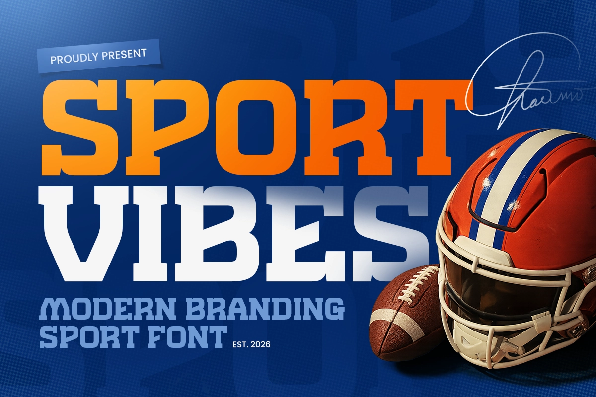
Sport Vibes has that clean, confident energy that works really well for modern sports branding. It's the kind of font you'd use when the goal is a polished, professional look without losing athletic intensity.
Use it for: team merchandise, jersey numbering systems, club identity kits, or social media headers for sports academies.
Design idea: Pair Sport Vibes with a bold single-color background for a tournament identity. Let the font do the heavy lifting with minimal graphic elements around it.
2. Sportino - Racing Bold Sport Font
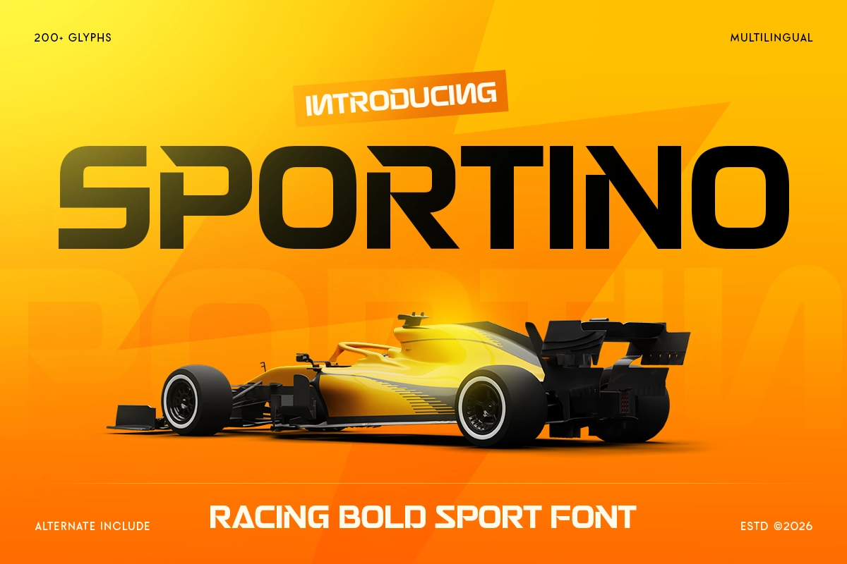
Sportino leans into speed. The boldness and structure make it read instantly even at small sizes, which matters a lot in digital assets and printed banners.
Use it for: motorsport event branding, racing team social posts, countdown graphics, or sports betting content.
Design idea: Use Sportino for large display numbers (lap times, scores, race numbers) layered over motion-blur photography. The contrast between sharp type and blurred background creates instant energy.
3. Crossfit - Modern Sport Racing Font
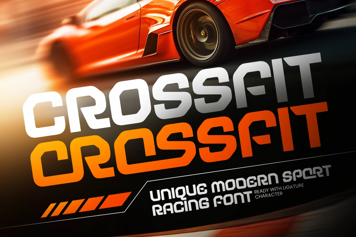
Crossfit sits in that functional-athletic space. It doesn't feel over-designed, which actually works in its favor for performance and training brands.
Use it for: gym branding, functional fitness events, athletic apparel, or training app UI.
Design idea: Stack Crossfit in all-caps across a dark background with a neon accent color. Works especially well for promotional content around challenge events or competition registrations.
4. Victoria Winter - Modern Sport Festival Font
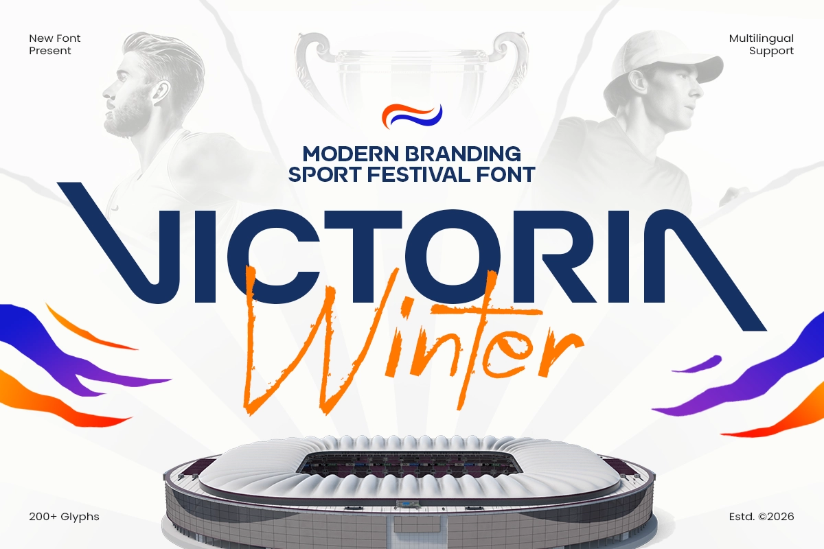
This one has a more celebratory, event-ready quality. Victoria Winter feels like something you'd see on a winter sports festival poster, with enough personality to stand apart from generic bold fonts.
Use it for: winter sports events, seasonal sports campaigns, outdoor festival branding, or sports tourism content.
Design idea: Layer Victoria Winter over gradient backgrounds that shift from cool blues to whites. Add light texture overlays to give it a frosted, premium feel.
5. Astedy Victoria - Logo Sport Festival Font
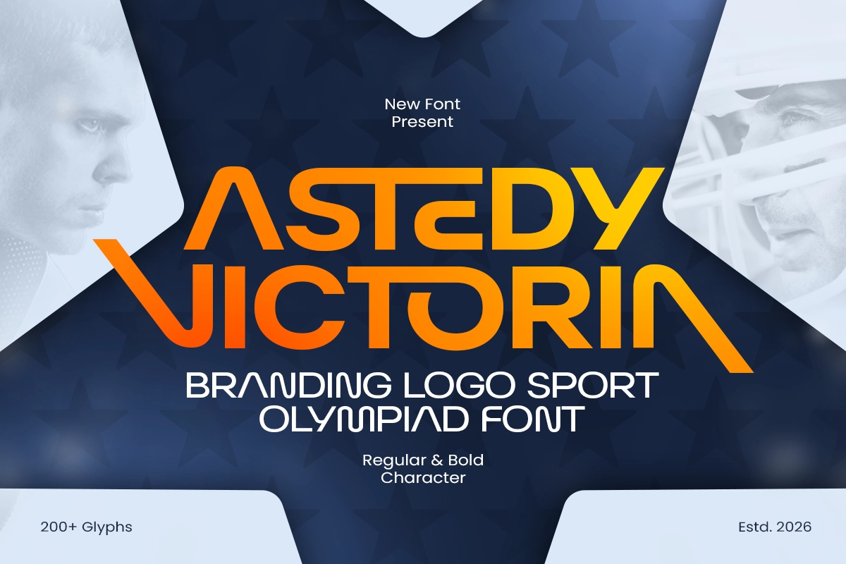
Astedy Victoria is more logo-friendly. It carries enough character to work as a wordmark without needing heavy supporting graphics.
Use it for: sports festival logo design, team name lockups, event wordmarks, or merchandise logos.
Design idea: Build a simple two-color wordmark using Astedy Victoria. Let it breathe with generous spacing and a clean emblem mark alongside it. Less is more here.
6. Striker - Modern Tall Sport Font
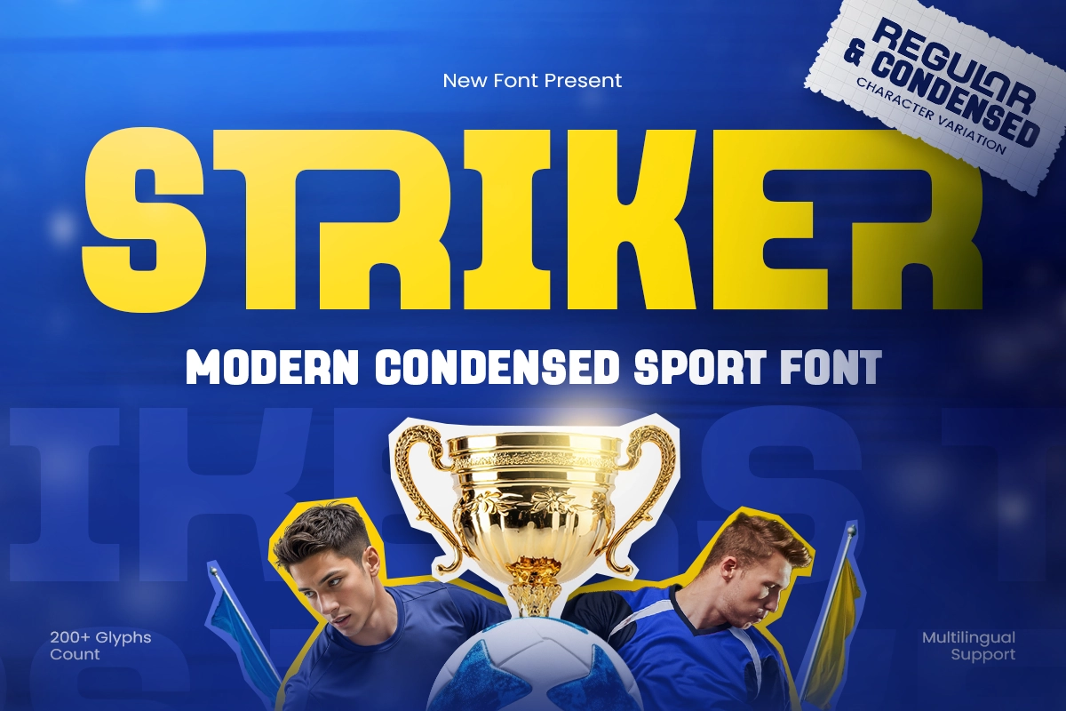
Striker's tall, condensed structure is ideal for anything that needs vertical punch. It's extremely useful in layouts where horizontal space is tight but you still need strong typographic presence.
Use it for: mobile-first sports graphics, Instagram Stories, sideline banners, or press backdrops.
Design idea: Use Striker for player name displays in digital matchday programs. The tall structure makes it easy to stack names cleanly inside narrow columns.
7. World - Modern Sans Serif Soccer Cup Font
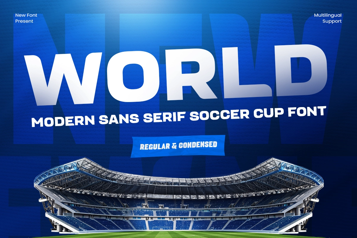
World is designed with the big stage in mind. The sans-serif structure keeps it accessible and versatile while still feeling current and sports-appropriate.
Use it for: soccer tournament identities, championship branding, broadcast graphics, or sports editorial design.
Design idea: Build a tournament identity system around World. Use it for the event name, group stage graphics, and match schedule displays. A consistent typeface across all touchpoints gives a tournament a cohesive, professional feel.
8. World Display - Creative Football Cup Font
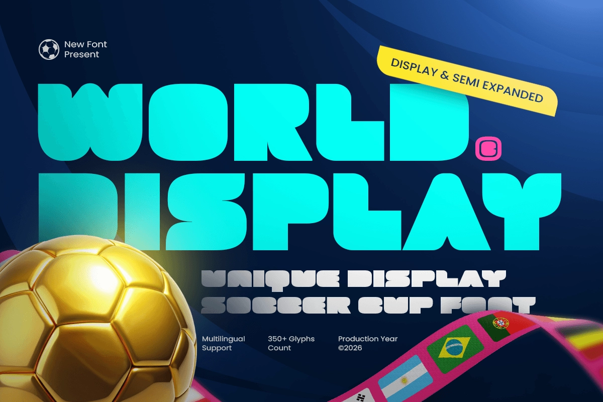
Where World is clean and systematic, World Display adds more personality. It's better suited for hero moments in a campaign rather than functional UI copy.
Use it for: key visuals, poster headlines, social media hero graphics, and opening ceremony branding.
Design idea: Combine World Display for headlines with World for body and supporting text. This creates a natural typographic hierarchy across a full campaign system.
9. Sport Ball - Modern Sport Varsity Font
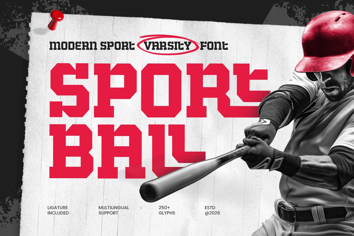
Varsity aesthetics are back in a big way, and Sport Ball hits that nostalgic-but-modern balance well. It connects with audiences who appreciate classic sports culture while still looking fresh.
Use it for: college sports branding, varsity team uniforms, sports streetwear collections, or throwback campaign visuals.
Design idea: Apply Sport Ball in a letterman-style layout on apparel mockups. Mix it with distressed textures and vintage color palettes for a retro collection feel that still reads contemporary.
10. Network - Branding Technology Logo Sport Font
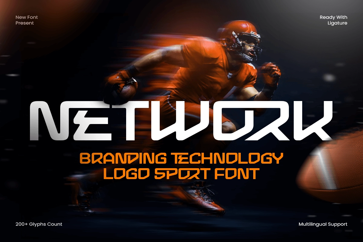
Network sits right at the crossroads of sports and tech, which is increasingly where modern sports branding lives. It has a structured, almost architectural quality.
Use it for: sports tech startups, sports analytics platforms, wearable sports brands, or esports organization branding.
Design idea: Use Network for a sports tech logo paired with geometric line patterns. The font's structure naturally suggests connectivity and data, which reinforces the tech narrative without over-explaining it.
11. Sportex - Modern Sport Tech Font
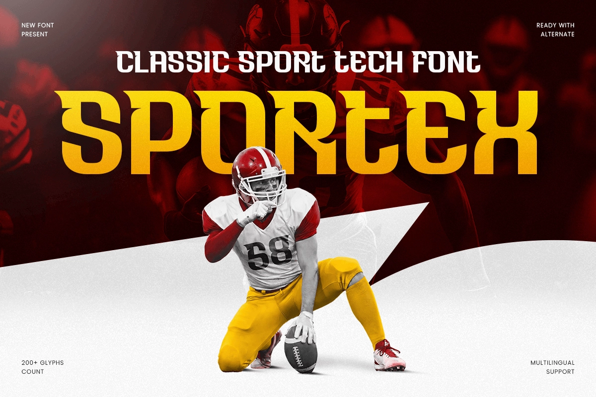
Sportex pushes the tech angle further. It has a futuristic precision that works well when you want to communicate performance, innovation, and high-spec equipment.
Use it for: sports equipment brands, performance apparel, athletic tech products, or gaming peripheral branding.
Design idea: Combine Sportex with a monochromatic colorway and sharp diagonal cuts in the layout. Think sleek product launch visuals where the typography itself signals precision engineering.
12. Victory - Headline Sport Logo Font
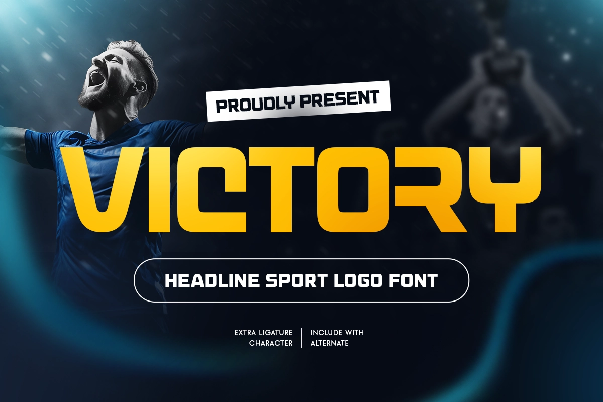
Victory does exactly what the name implies. It commands attention and reads like a winner. Strong enough for headlines, clean enough for logos.
Use it for: championship announcements, award ceremony branding, sports media outlets, or sports motivational content.
Design idea: Use Victory for a post-match result graphic. Team name in Victory at large scale, with a color split behind the graphic that reflects each team's identity color. Clean, bold, shareable.
13. Monsta - Modern Sport Techno Font
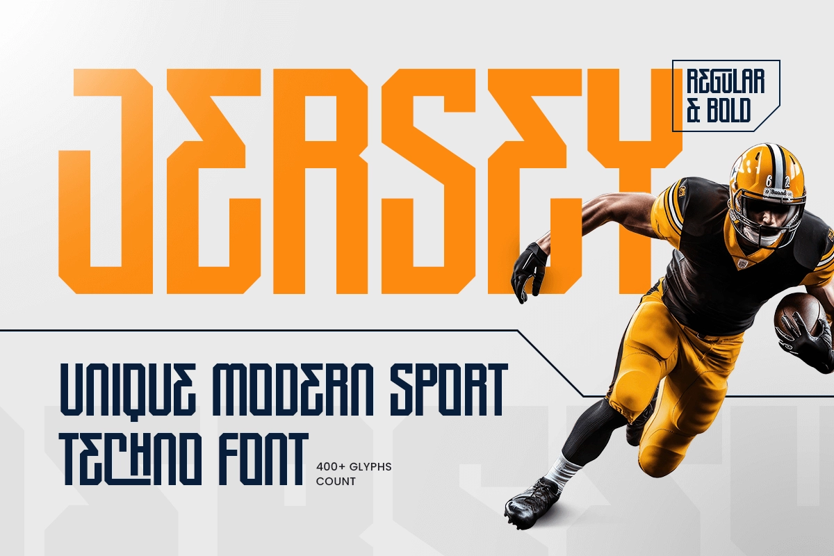
Monsta brings a raw, aggressive energy that suits certain sports niches really well. It's not for every brand, but for the right one, it's unforgettable.
Use it for: extreme sports, fight sports branding, game titles, or high-intensity training brands.
Design idea: Use Monsta for a UFC-style event poster. Full bleed athlete photography, Monsta handling the event name and date. Keep the supporting type minimal so Monsta can hit hard.
14. Sportico - Techno Sport Font
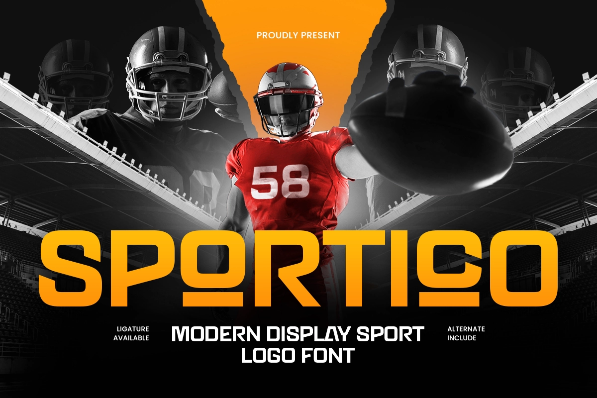
Sportico balances techno aesthetics with readability. It doesn't sacrifice clarity for style, which makes it more flexible across different formats.
Use it for: sports app UI, scoreboard graphics, digital broadcast overlays, or sports-focused content creator branding.
Design idea: Build a scoreboard template using Sportico. Design it as a reusable asset for sports content creators who want professional-looking match result posts without starting from scratch every time.
15. Flarex - Unique Gaming Logo Font
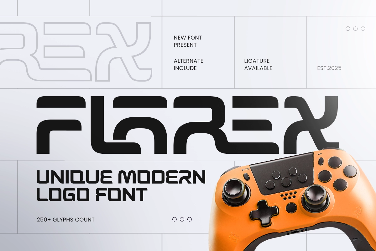
Flarex leans gaming. It has that sharp, electric quality that gaming audiences instantly recognize and respond to.
Use it for: esports team logos, gaming tournament graphics, Twitch overlay design, or gaming merchandise.
Design idea: Pair Flarex with glitch animation effects in motion graphics. Even a subtle horizontal glitch on the team name intro adds a layer of visual storytelling that resonates with gaming culture.
16. Haste - Modern Techno Sport Logo Font
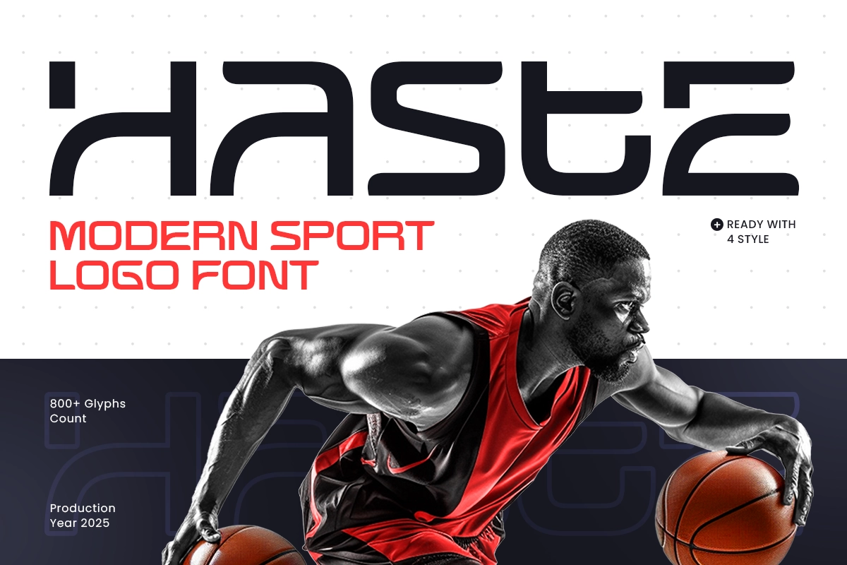
Haste feels kinetic. The name says it all. It's a font that suggests momentum, and that's a valuable quality in sports design.
Use it for: sprint sports branding, sports betting platforms, race event identities, or athletic footwear campaigns.
Design idea: Use Haste in a campaign built around speed stats. "0 to 100 in 9.8 seconds" rendered in large Haste type, with motion-trail effects behind the numbers. Pure kinetic energy.
17. Sport Event - Modern Sport Athletic Font
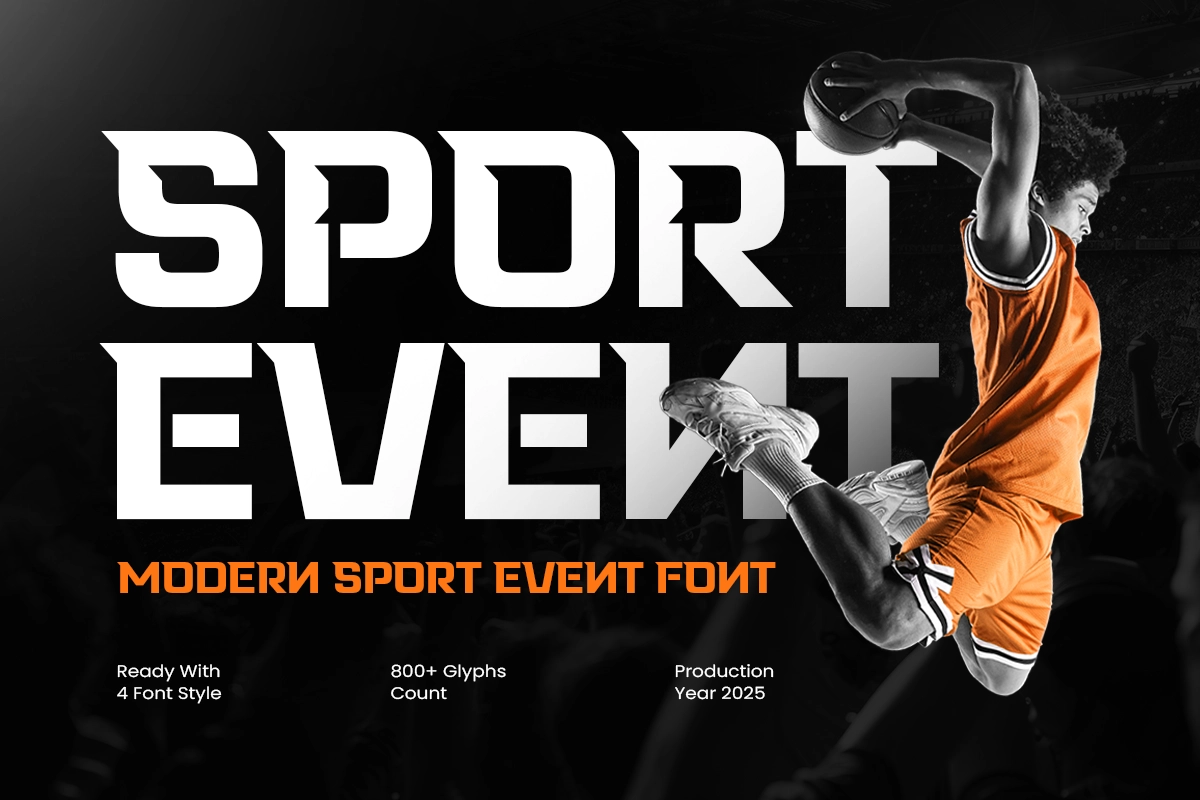
Sport Event is a workhorse font. It's versatile enough to handle multiple use cases across a single event campaign, from signage to digital.
Use it for: general sports event design, athletic meet branding, school sports days, or community sports campaigns.
Design idea: Use Sport Event across a full event kit: schedule graphics, wayfinding signage, social posts, and print programs. Consistency across every touchpoint is what makes community sports events look properly organized.
18. Time Out - Modern Sport Brush Font
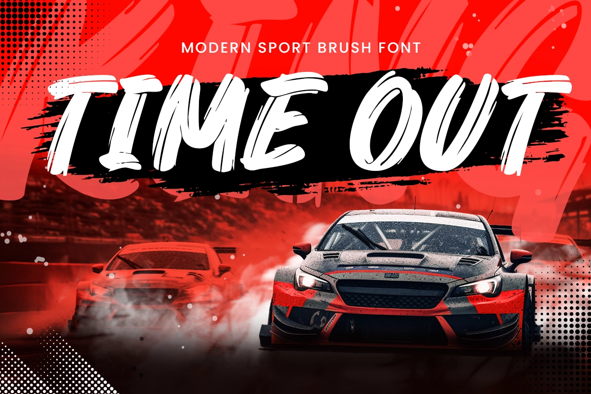
Time Out breaks from the tech direction. The brush quality adds a human, expressive element that works well for sports content that wants to feel authentic rather than polished.
Use it for: sports lifestyle content, athlete personal branding, sports journalism editorial design, or community sports social media.
Design idea: Layer Time Out over candid athlete photography for a sports documentary-style visual. The handcrafted quality of the font complements real, unfiltered moments much better than a clean sans-serif would.
19. Megan - SciFi Sport Techno Font
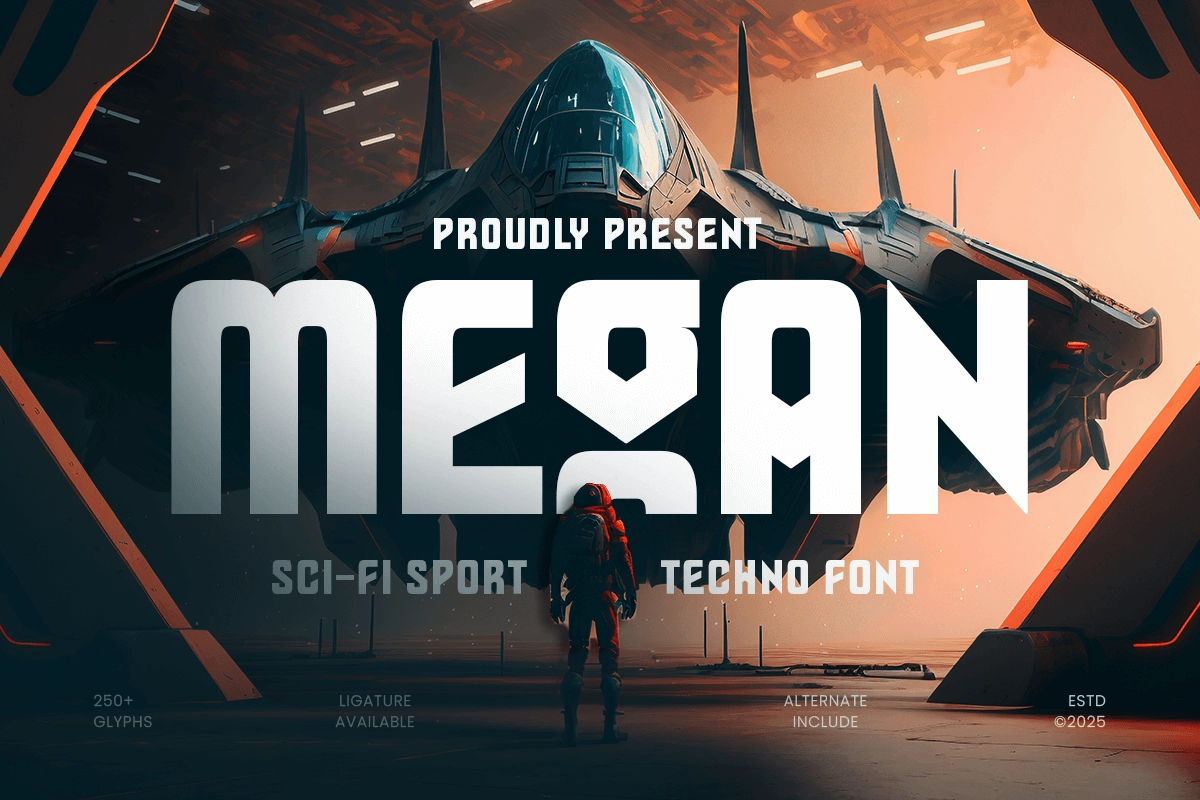
Megan is for the future-forward projects. It has a sci-fi edge that pushes into territory beyond conventional sports design.
Use it for: futuristic sports league concepts, AR/VR sports experiences, sports-tech concept branding, or next-gen esports event visuals.
Design idea: Use Megan for a speculative sports league concept. Think "2047 Global Speed League" kind of energy. Pair it with holographic color effects and you've got something that genuinely looks like it belongs in a future world.
20. Ranger - Futuristic E-Sport Font
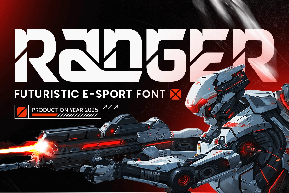
Ranger is built for esports, full stop. It carries the intensity and futuristic language that esports audiences expect from competitive gaming visuals.
Use it for: esports team identities, gaming tournament key visuals, gaming content channels, or competitive gaming merchandise.
Design idea: Build an esports team identity around Ranger. Team name as wordmark, player positions displayed in a secondary weight, jersey numbers in the same typeface. A consistent typographic system makes even a new esports team look like it has been around for years.
Building a Visual Direction, Not Just Picking a Font
One thing that separates good sports design from great sports design is intent. Picking a font at random because it "looks sporty" is different from choosing a typeface because it carries the specific energy your project needs.
Ask yourself before you start: Is this campaign about power or speed? About community or elite performance? About history or the future? The answer changes your font choice, your color approach, your entire visual language.
If you're looking for a starting point, Sensatype offers a collection of sports and display fonts built specifically for this kind of work. From varsity to techno to sci-fi, the library covers the full range of sports design directions, and browsing it is a good way to clarify your visual direction before you commit to a design path.
FAQ
What makes a font "futuristic" for sports branding? Futuristic fonts in sports design typically feature sharp geometric forms, condensed structures, tech-influenced details, and strong visual weight. They suggest speed, precision, and innovation rather than tradition or craft.
Can I use the same font for different sports brands? Technically yes, but it's not ideal. Each sport has its own culture and visual language. A font that works perfectly for an esports brand might feel off for a community soccer event. It's worth choosing a typeface that fits the specific sport and audience you're designing for.
What's the difference between a display font and a logo font in sports design? A display font is designed for large-scale headline use, like posters and key visuals. A logo font is optimized for smaller applications and works well as a wordmark. Some fonts work for both, but using each in the right context gives your design better overall balance.
How many fonts should I use in a sports design project? Two is usually the sweet spot. A strong display or headline font paired with a clean, readable secondary font for supporting text. More than two fonts in one system can start to feel chaotic unless you have a clear reason for it.
Do futuristic fonts work for print as well as digital? Yes. Most of the fonts on this list are designed to perform well in both environments. Just make sure to check how the font renders at the sizes you need, especially for smaller print applications like programs or accreditation passes.
Where can I find quality sports fonts for my projects? Marketplaces like Creative Market, MyFonts, and dedicated type studios are good places to explore. Sensatype specifically focuses on sports and branding typography, which makes it a practical starting point if you're working within this niche and want fonts that are purpose-built for the direction.